.png)
Next Step Planner
Next Step Planner is an app designed for students who have ADHD and struggle with executive functioning skills. It is designed to empower these students to mange their homework time effectively and stay on top of their assignments.
UX, Research, App Design, Branding, Figma

Background
This project was a chance for me to design something that would have been extremely helpful for me as a student growing up. I set out to create something that would make managing nightly homework assignments and long term projects much more manageable.
Interviews
The interviews I conducted revealed some of the struggles that students with ADHD encounter in school. They experience challenges with managing long term assignments, not getting overwhelmed by busy worknights, and creating and sticking to homework schedules, among other things.
.png)
.png)
Personas
Personas were created based on what was learned from the interviews. These personas served as a representation of the types of users this app is supposed to help during the remainder of this project.
Feature Set
I then created a feature set for this app and prioritized them based on their necessity to be included in the final app. The features included in the highest priority tier are the ones that are essential for the app to function as intended and make up what is need for the minimum viable product.
.png)
Competitor Analysis
Researching competitors was a difficult process. There weren't any competitors that I could find that worked in the same way that I wanted my app to function. So I found some similar educational services that shared some features and examined what some of their strengths and weaknesses were.
.png)
User and Task Flows
The task flows for this project were fairly simple. One of the main reasons for this was my desire to have the experience of using this app to have as few moving pieces as possible, as not to distract or overwhelm the users.

Lo-Fi Wireframes
While designing the low fidelity wireframes I wanted to place an emphasis on having the next step be as clear as possible. The intention was to try and keep the user on track with their nightly homework and long term assignments.

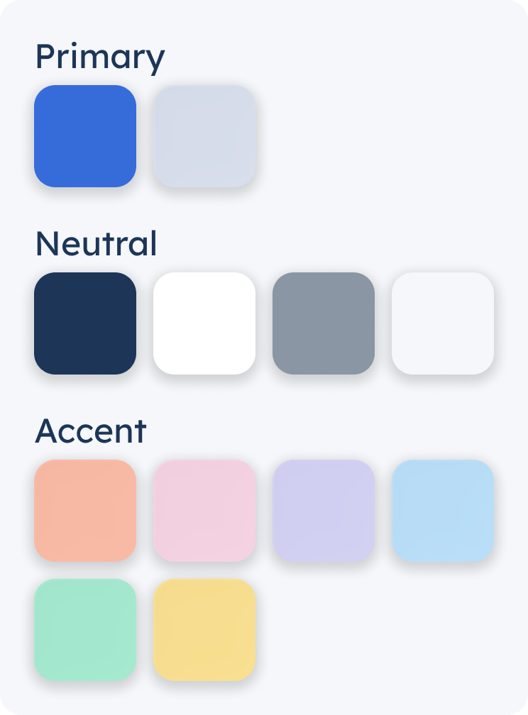
Branding
The branding decisions for this app were designed with the goal of keeping out any bright and distracting elements. I still, however, wanted to include some fun colors to allow for the ability to color code assignments by class. The logo was made to resemble the assignment cards that will be used on the calendar and a set of steps similar to the name of the app.
.png)

Hi-Fi Wireframes
As always this step is the most fun for me, I love seeing the whole design start to come together. I did my best to try and make it so that it was easy for the user to find what was needed without too much extraneous information distracting from it.

UI Kit
I created re-usable components on Figma to make the process of editing and adding additional screens to this app easier in the future.

Usability Testing
Using a prototype made from my high fidelity wireframes I asked a few people to test out my app and get feedback. The users were overall very interested in the concept of the app and provided some helpful feedback.

Iterations
There were some obvious room for improvement after getting feedback during usability testing. A few changes were made based on what the users suggested and I also made some changes to the aesthetics of the app.
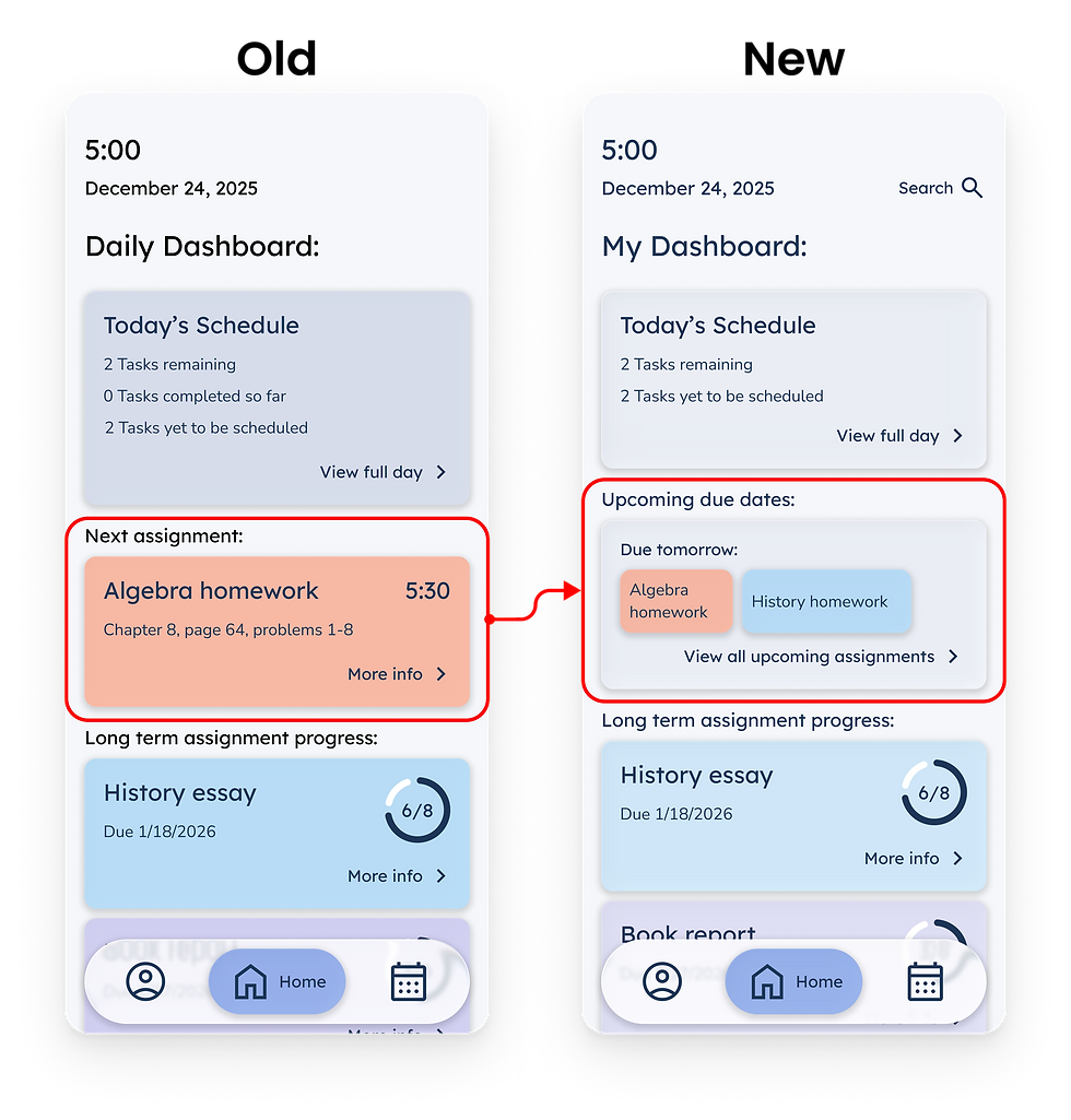
Iteration Example #1
One of the things that many users expressed was the desire to have a way to view all the assignments that were due the next day. Previously you could only see the due date for each assignment individually and not see them all at once. So I switched the next assignment section on the dashboard to an upcoming due dates section, as well as added an extra page the show all the upcoming due dates for the week.
.png)
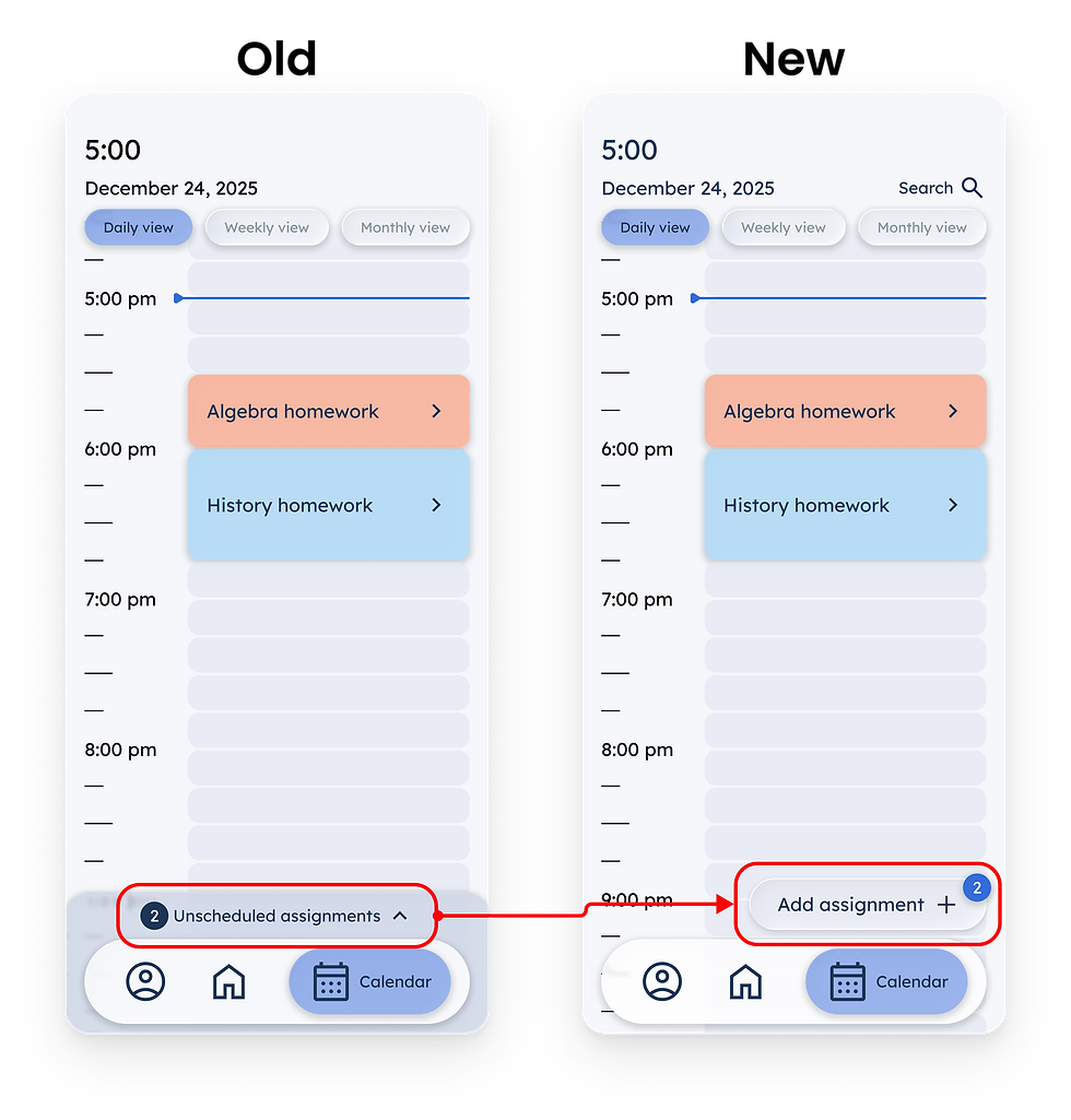
Iteration Example #2
All of the users that tested the prototype said that they expected the way to add assignments to their calendar would be through some kind of button that included a plus sign. So I changed the way that assignments are added which allowed me to also provide a way for users to manually add assignments and not just schedule the assignments that the teachers had uploaded to the app, additionally a way to have the long term assignment chunks and one time assignments in separate places.
.png)
Updated Protoype
With the newest versions of the wireframes I updated the prototype. This showcases the most polished version of the wireframes for the Next Step Planner app.

Final Wireframes
These are a handful of the final wireframes for the Next Step Planner app. I really enjoyed this project and am pretty proud of the final results. This turned into an app that I would have loved to have been able to use when I was back in grade school.
.png)
Dashboard
.png)
Daily Calendar View
.png)
Add Assignments
.png)
Weekly Calendar View
.png)
Monthly Calendar View
.png)
Homework Details
.png)
Long Term Assignment
.png)
Upcoming Due Dates