.png)
.png)
UX, Research, Responsive Web Design, Figma
Legends Distillery
Legends Distillery is a whiskey distillery based in Israel. For this project I visually overhauled their website and updated their shop and tour booking flows, among others.
Project Background
This project I was tasked to redesign an existing website and make it responsive for both web and mobile. I chose to redesign the website for Legends Distillery, they are a local distillery who make amazing whiskey but have a website that really needs to be improved.
Initial Research
The first step that I needed to take for this project was to look into the existing website for the distillery. I was able to learn what features the website currently offers and which areas need to be improved.
Interviews
As part of my researched I interviewed potential users of this website to learn what is important to users in a distillery website and what they would want to see as part of a redesign for this website.
.png)
Personas
Upon completing the initial research and interviews, I used the information I learned to create a couple of personas. These personas were used throughout the design process to guide my decisions.
Jim Halpert
Sales Manager
Jim is a long-time whiskey collector who enjoys learning about distilleries and trying new, exclusive releases. He often travels to distilleries when he can and loves sharing tasting notes with friends.
Danielle Jones
Graphic Designer
Danielle loves discovering new experiences when traveling and is always looking for memorable activities to photograph and share. She’s never been to a distillery before but was intrigued when planning a trip.
Competitor Analysis
I did some quick research on other existing products that try and help people solve this issue in order to learn what they do well and what they struggle with.
Name
Milk and Honey
Golani Distillery
Thinkers Distillery
Strengths
-
Good strong branding that is consistent throughout their website
-
Cart and checkout experience is clean and straightforward
-
Scales up and down reasonably well
-
The images and visuals on the site are bold and engaging
-
Overall gives off a premium quality feel
-
The website is pretty simple and straightforward with few elements that aren’t strictly necessary
-
I like that they show featured products on the homepage
-
Scales up and down really well and in a logical manner
-
Fun and bold branding throughout their website
-
A simple website but it feels like almost everything you need is included
-
Scales up and down very well
-
Good tour scheduling section, clear calendar interface to choose dates and see prices
Weaknesses
-
It feels like there are slightly too many options everywhere, when opening the hamburger menu there are an overwhelming amount of choices
-
Although it scales well, the close button for the hamburger menu shows up in an unexpected spot on smaller screens
-
There are separate product and purchase pages, the detailed info for a product is in a different spot then where you go to buy it
-
No filter or sort options on the shop product page
-
Some of the animations can sometimes cause a little bit of lag in loading the pages
-
Some of the images used are pretty low res giving the website an outdated and low quality feel
-
There are a few parts of the UI that feel a little inconsistent
-
Despite the strength of being simple and straightforward, the website doesn't feel like it has much that is engaging or interesting
-
Some of the navigation buttons are repetitive and not super clear
-
There is no info for tours, just a contact form with no explanation
-
Their home screen is also the screen where you see the products listed for purchase, its a slightly weird setup
-
There is no expanded product page, you just add to cart straight from the home screen/products page
-
Some of the text sections feel like a little to much, its hard to focus on and read the large blocks of text (especially on the about us page)
User and Task Flows
Before beginning the wireframes I laid out the user flows for the website. The flows for this design were relatively straight forward, as the main flows for the user would be buying whiskey and booking a tour.

Lo-Fi Wireframes
I began to create low fidelity wireframes for both the mobile and desktop sites. I tried to pay attention to keeping a consistent experience across both platforms.
.png)
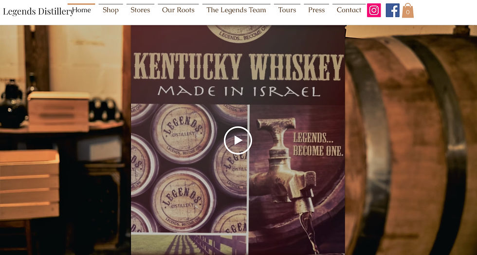
Home Page
.png)
Products Page
.png)
Checkout
.png)
Tours
%20(1).png)
Homescreen
.png)
Tours
Hi-Fi Wireframes
The next step was to create the high fidelity wireframes, again with the emphasis no consistency across mobile and desktop experiences. The biggest challenge with these designs was finding the adequate product photographs for all the different parts of the website.
%20(1).png)
Home Page
%20(1).png)
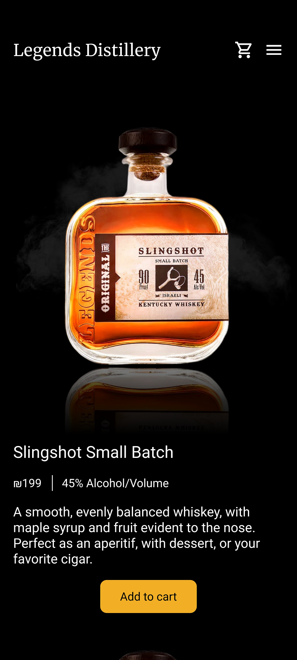
Products Page
%20(1).png)
Checkout
%20(1).png)
Tours
%20(2).png)
Homescreen
%20(1).png)
Tours
Usability Testing
I took both the mobile and desktop wireframes and created a figma prototype. I asked users to test several flows and give their feedback, on both their ability to complete various tasks and the consistency between the platforms.

Iterations
The users gave some very helpful feedback. After hearing this I made a handful of iterations to both the mobile and desktop websites.
Iteration Example #1
Users expressed some confusion about the color and location of the "place order" button. Previously it was gray and disabled until all the relevant details were filled in, now after inputting all the details the "review and place order button" appears where the details were input. This makes it super easy for users to move through the flow because the information is presented right where they need it to be.
.png)
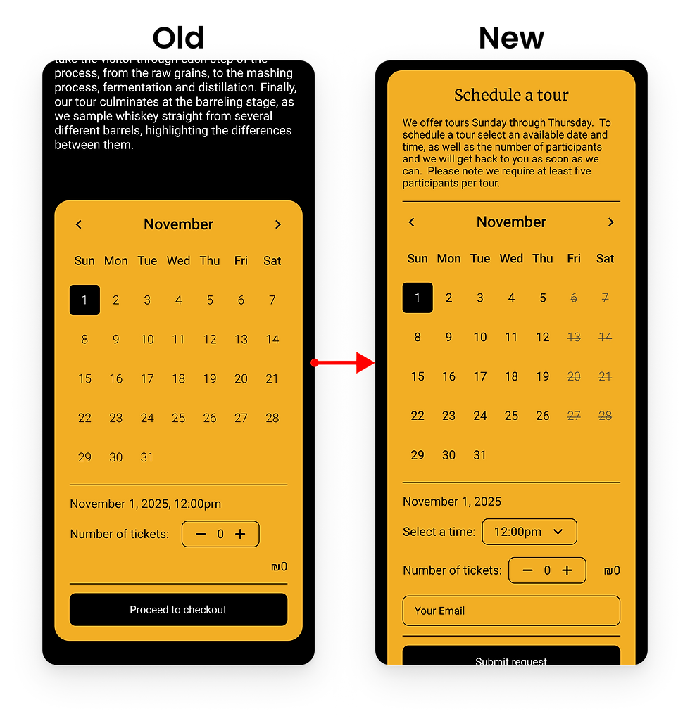
Iteration Example #2
The user pointed out that the tour booking flow needed many adjustments. Days in which there are no available tours are now shown on the calendar. A few details about the tour booking process were added to the top of the calendar to eliminate any possible confusion. A drop down menu to select the time was also added.
.png)
Updated Prototype
After iterating on all of the wireframes I updated the prototype for the website so that it would reflect the most up to date version of the product.

Final Wireframes
Below are a sample of the final wireframes for this project. I really enjoyed this project in which I designed a website in a different style than I usually go for. It was great to be able to practice working on responsive designs and translating that different style to many different viewport sizes.
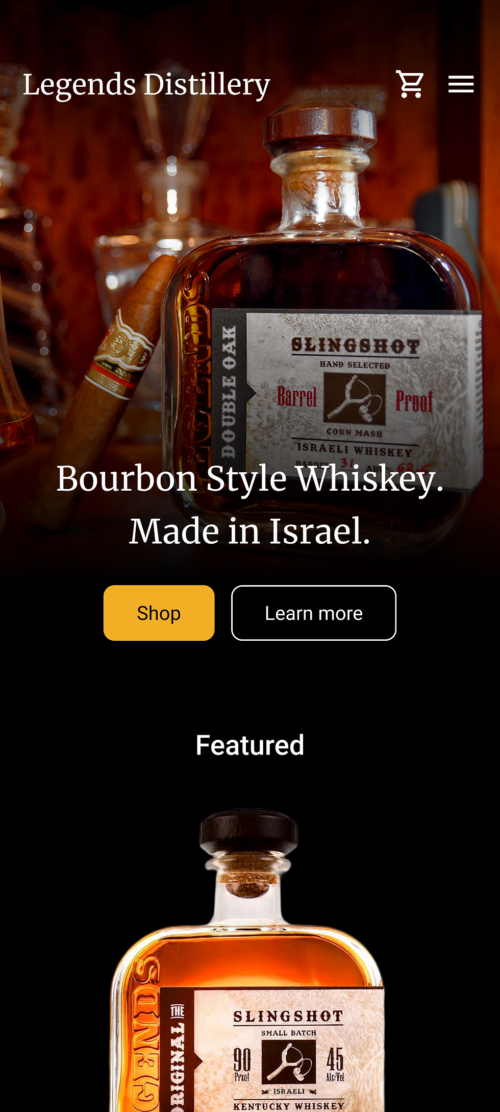%20(2).png)
Home Page
%20(2).png)
Products Page
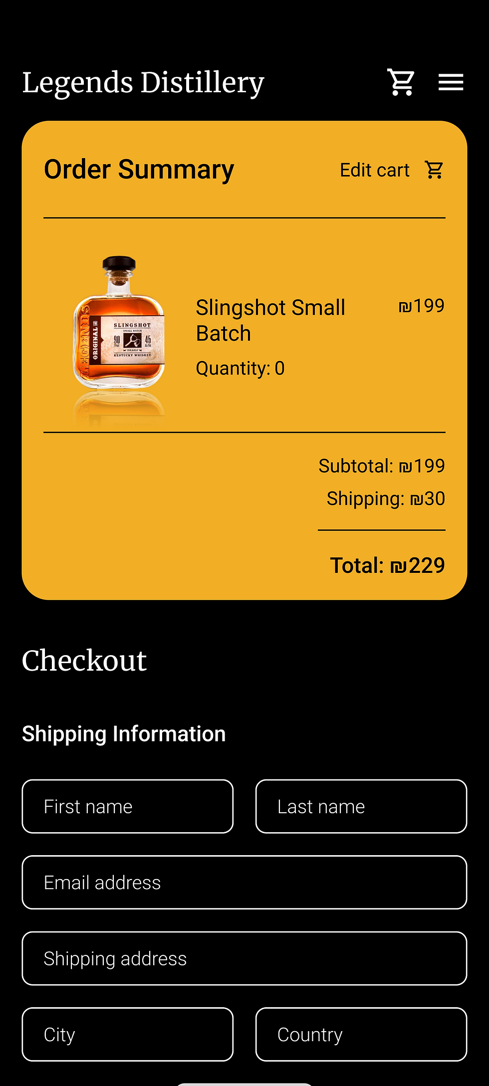%20(2).png)
Checkout
%20(2).png)
Tours
Homescreen
%20(2).png)
Tours